4 Ways to Enhance Your Data Visualizations
We all know that good data is important for personal and professional decision-making. However, whether we’re using images, charts, tables, or graphs, how we present data in an impactful way is often overlooked. In this piece, we’re going to consider some best practices and tips to help you get the most out of your data visualizations and graphics.
We’ll go over the following best practices checklist, and provide some tips on how to create your best visualizations:
- Use appropriate and simple graphics
- Keep your graphics professional and legible
- Include robust captions
- Consider accessibility
1. Use Appropriate and Simple Graphics
Overall, when creating visualizations or graphics to strengthen or explain your project, you need to consider both your argument and your audience.
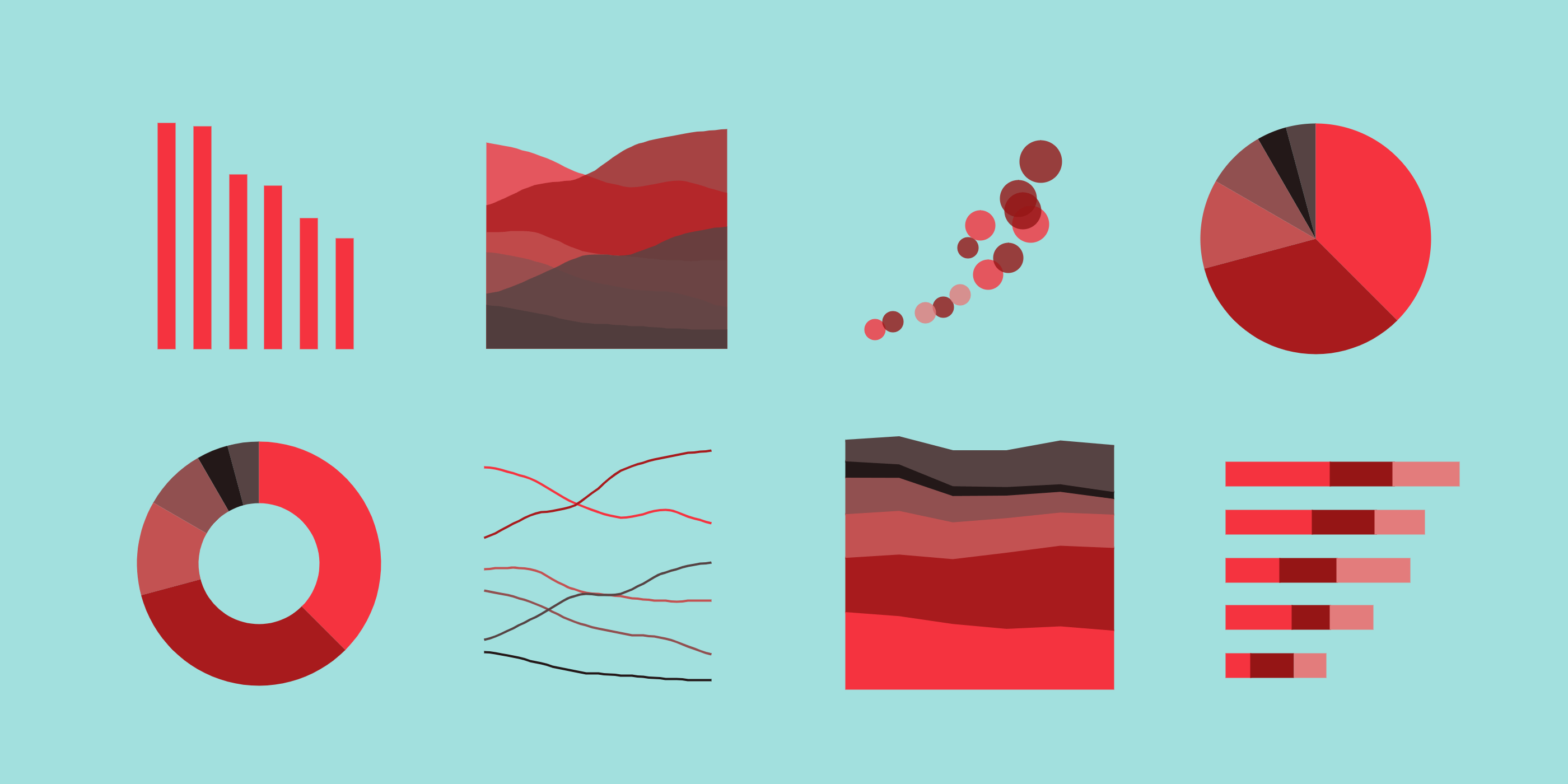
Your graphics should represent a specific point you’re trying to express. Consider what you’re trying to achieve with your visualization and, if you can, simplify! Relatedly, make sure your graphics are easy to interpret. Data visualizations are increasingly easy to make and easier to make complex! As a basic example, consider Figure 1.
Obviously, “ease of interpretation” will vary with your intended audience. For example, a graph for a highly-specific medical journal may have a different level of complexity than one made for Twitter. Additionally, remember that your audience’s level of understanding may be at odds with their level of engagement. For example, a subject matter expert assigned to read a grant may not be able to spend much time interpreting an overly-complex graphic, regardless of how strong of a point that graphic makes.
TIP: For complicated graphics, try to break them into several graphics that each illustrate a smaller concept.
TIP: If your graphic seems complex or is not *quite* conveying what you’d like, try a different kind of graphic. Would a pie chart or bar graph be simpler? Would a scatterplot or table better represent what you’re trying to say?
2. Make Sure Your Graphics are Professional and Legible
Although many of us do some of our finest work while doodling on napkins, your graphics should reflect a high level of professionalism. Sketches can be a crucial part of your workflow, however, taking the time to polish your visualizations will pay off. Not only will those polished graphics be more readily understood by your readers, they will also indicate a certain level of care that you’ve taken with your ideas and arguments.
TIP: SparkMap’s Community Needs Assessment tool automatically generates many helpful, eye-catching graphics that you can use immediately in your proposals.
3. Include Robust Captions
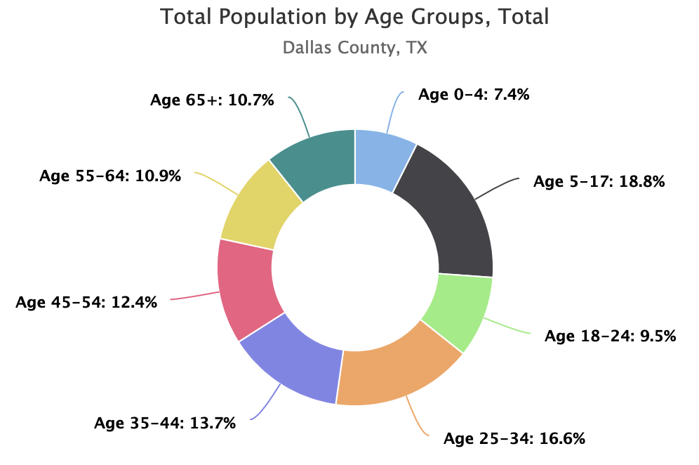
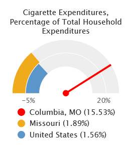
On its face, the purpose of a caption is to describe a figure. However, a good caption should not only describe your graphic but also strengthen or clarify a point you’re trying to make. In other words, use the caption text to explain how the graphic enriches your point to the user, not just to restates what the visualization is showing.
Consider the following example. Below, the same image is captioned twice. The first caption describes the data – it’s fine, but doesn’t make the connection for the reader to the point we’re addressing with the graphic. The second figure describes the data, what is important about the data, and ultimately uses the graph to discuss a broader point.

That being said, try to keep the length of your caption text to a minimum.
TIP: If you find your captions getting too wordy, try summarizing your point in the caption and more fully describing the argument elsewhere.
4. Consider Accessibility
This final point is an increasingly important one, as our data visualizations are meaningless if the audience cannot access and interpret them. There are many different types of visual abilities, and we need to consider as many of them as possible when creating visualizations. We suggest the following items as a starting point to determine the accessibility of your data visuals:
- Font size: is it large enough?
- Colors: do they contrast enough for the colorblind?
- Labels: are your variables and axes labeled clearly and sufficiently?
TIP: For a handy and more thorough checklist for visual accessibility, visit the Government Services Administration’s website about accessibility and visual design: https://accessibility.digital.gov/visual-design/data-visualizations/
TIP: https://webaim.org hosts many references and tools to understand and check accessibility. Their contrast checker is an especially excellent tool to help support low vision users.
Final Tip: Put it to the Test
Once you’ve gone through this checklist, it’s time to field test your work. Ask your colleagues to look over your graphics and, if possible, get a friend who is not as familiar with your work to look over your graphics. Can a non-subject matter expert understand what you’re trying to convey? Insights from your target audience(s) help to illuminate strengths and points of improvement you may not have considered.