How to Navigate Your Premium Community Needs Assessment
Learn step by step how to explore your Premium Community Needs Assessment. Note that this tutorial will focus on report features available only to Premium SparkMap Subscribers. For a basic introduction to report navigation and visuals, check out How to Navigate Your Community Needs Assessment.
Navigate Your Report
Introductions & Data Tables
Data Visualizations & Benchmarks
Report & Download Options
Note: This page discusses features included in a completed Premium Community Needs Assessment. To learn more about Premium location selection options, check out How to Use the Draw My Area Tool and How to Use the Pick From Map Tool. To learn about Premium data, check out our Premium Indicator List.
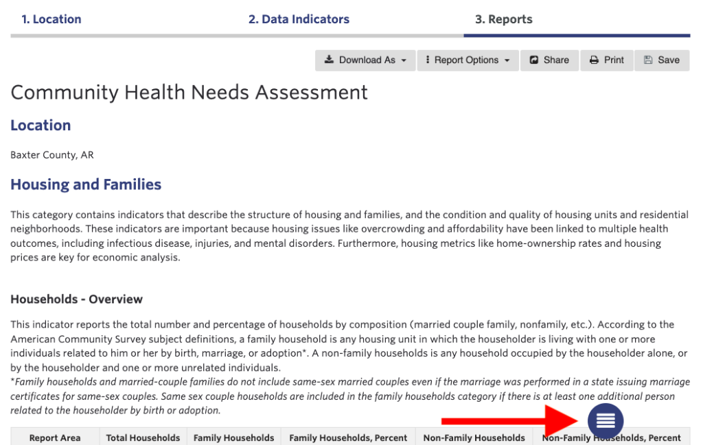
In your report, navigate between indicators using the round menu button at the bottom right corner of the page (Figure 1).
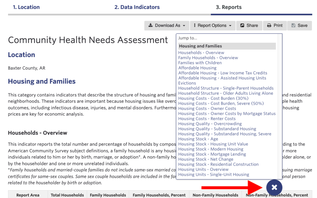
Click the button to open the indicator menu. Then, to close the indicator menu, click the round button with the “x” icon (Figure 2).
When the indicator menu is open, a clickable list of indicators will appear. Click the name of an indicator to jump to its section on your report.
Note: Clicking the “Back” button on your browser will exit the completed assessment and send you back to the previous step.
Step 2 – Introductions and Data Tables
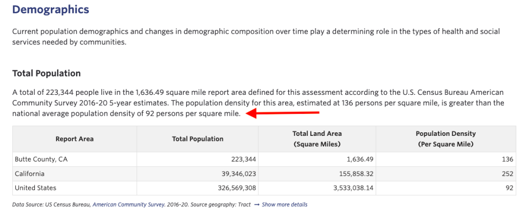
Each indicator section begins with a dynamic introduction paragraph. These introductory texts provide concise summaries of the indicator as it relates to your selected location (Figure 3).
Data provided in the introductory sentences are also displayed in the subsequent tables, maps, and charts.
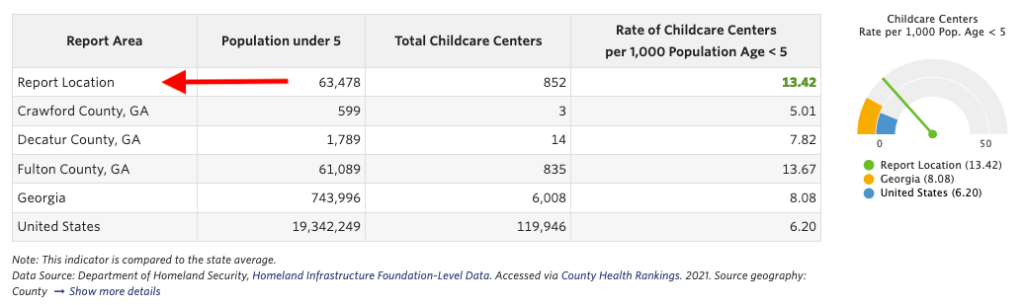
Data tables first display aggregated data for your selected location(s), then rows for county, state, and national benchmarks (Figure 4).
Note: Data source, release date, and geography information are available below each data table.
Step 3 – Data Visualizations & Benchmarks
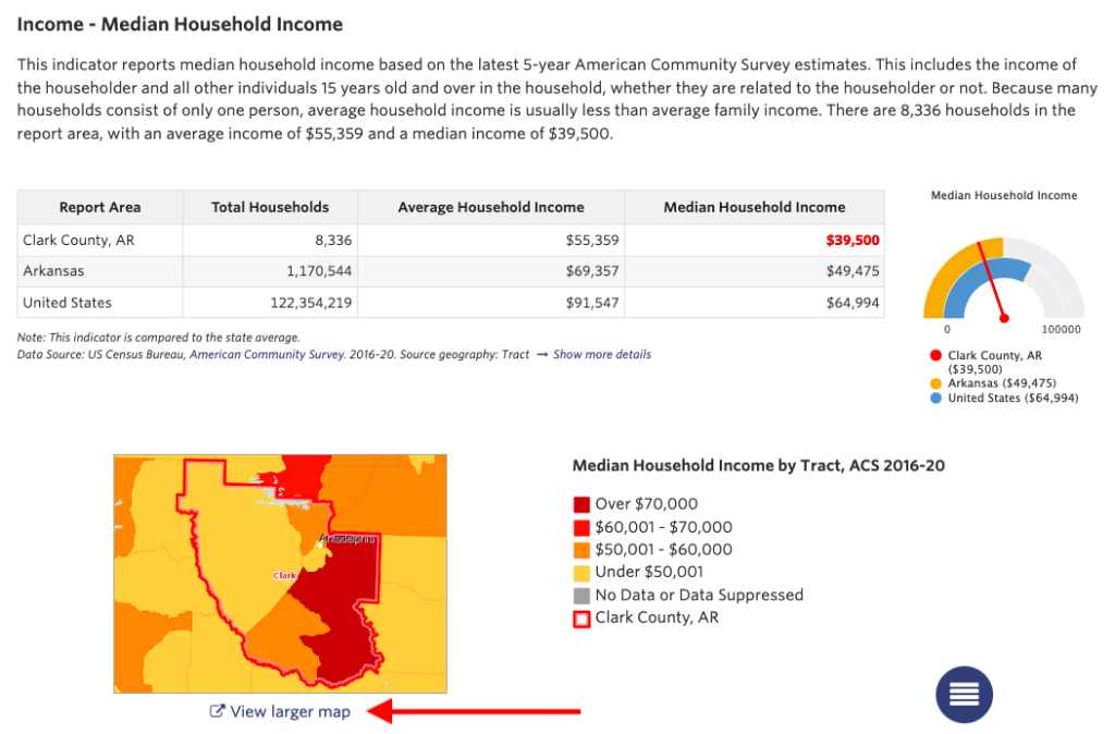
There are several types of visualizations in a completed assessment. First, inset maps are available for most indicators. Inset maps provide a quick geographic view of the data and will display your selected location. Click the “View larger map” link to view and interact with the data in the Map Room (Figure 5).
Note: Maps display data at the smallest geography available (e.g. – census tract, school district, or point level) while data tables display data at the county or ZIP code level depending on your location selection(s).
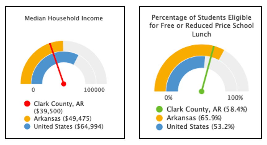
Next, many indicators also include data dials. Dials are a quick way to visualize how your selected location compares to state and national averages, or benchmarks.
The dial appears red if your selected location is performing worse than state and/or national averages. The dial will show green if your selected location is performing the same or better than state and/or national averages (Figure 6).
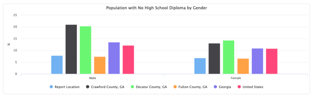
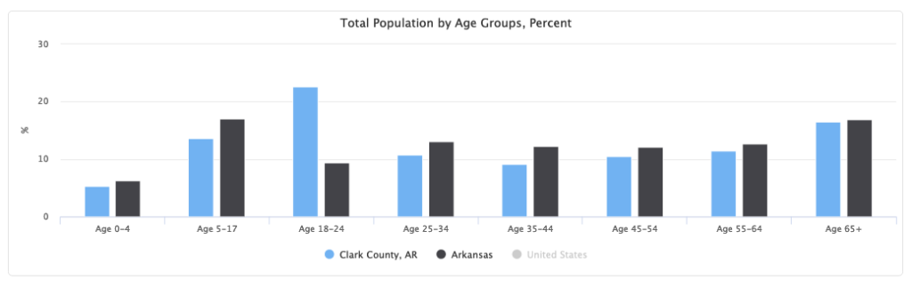
Charts and graphs are also commonly included. Hover over the charts and graphs to display associated data values (Figure 7).
Bar charts include state and national averages for easy comparison. State and/or national averages can be toggled on and off by clicking the geography name (e.g. Alabama and United States) at the bottom of the chart (Figure 8).
Line graphs show trends over time, where available. Hover over the line graph to display associated data values. Click the geography names to toggle state and national averages on and off.
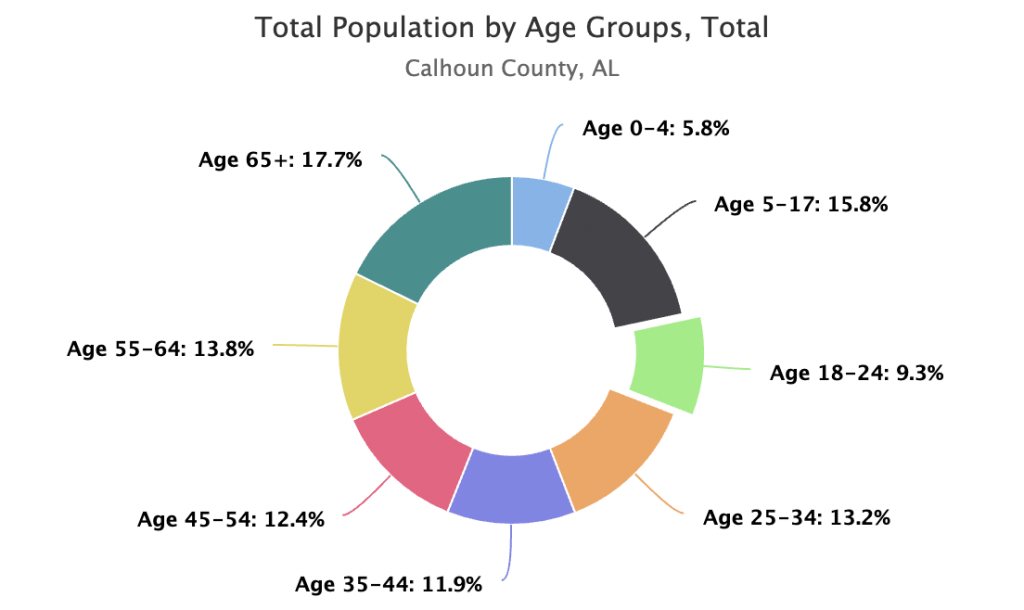
Finally, pie and donut charts display indicator data and breakout information. Click a portion of a pie or donut chart to highlight the section (Figure 9).
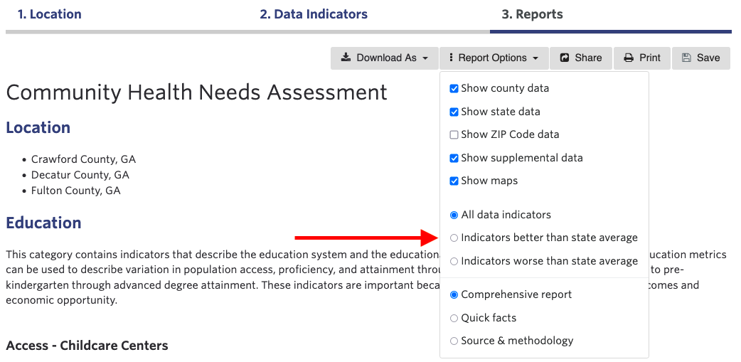
Premium Subscribers can also create benchmark reports. To load a benchmark report, click the “Report Options” button at the top right of the page and click the button for “Indicators better than state average” or “Indicators worse than state average” (Figure 10).
Step 4 – Report & Download Options
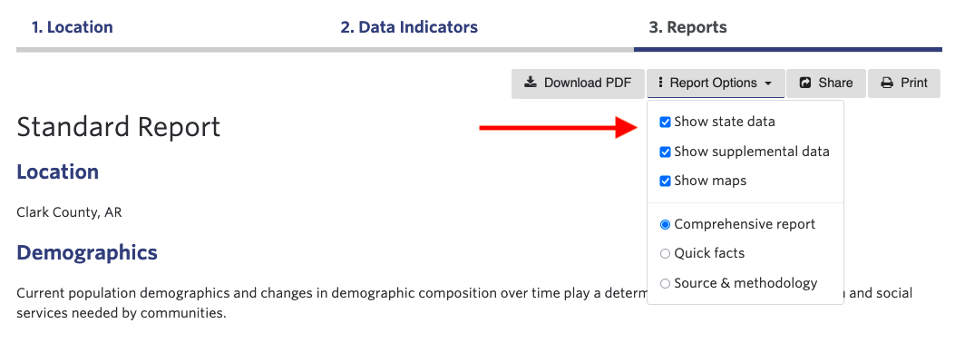
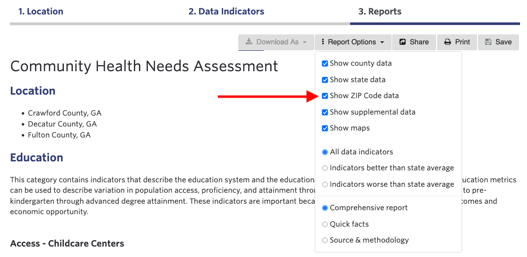
Customize your report using the “Report Options” button (Figure 11).
Add or remove state averages/benchmarks by clicking the checkbox next to “Show state data.”
Add or remove breakout data by clicking the checkbox next to “Show supplemental data.”
Add or remove inset maps by clicking the checkbox next to “Show maps.”
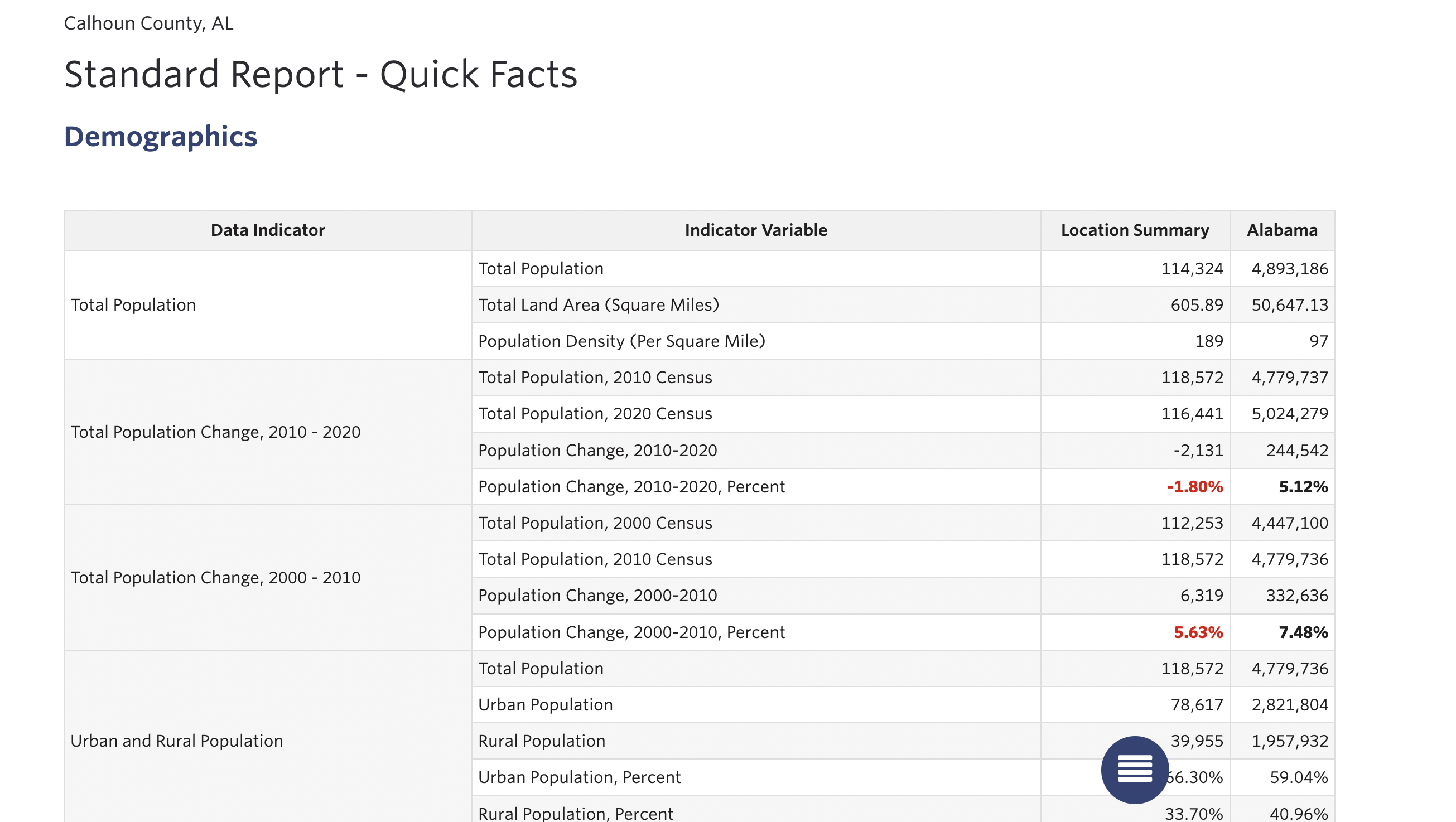
Get a “Quick Facts” report but clicking the radio button next to “Quick facts” (Figure 12).
Generate a source and methodology appendix by clicking the radio button next to “Source & methodology.”
Premium Annual Subscribers can also create a ZIP code report by clicking the “Show ZIP Code data” checkbox (Figure 13).
Note: After clicking the “Show ZIP Code data” checkbox, your report will re-generate and may take a few minutes to load.
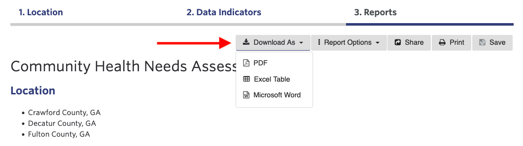
Premium Subscribers can download a completed Community Needs Assessment Report as a PDF, Word, or Excel file. Click the “Download As” button at the top right of the page to select your export option (Figure 14).