Map Room 101
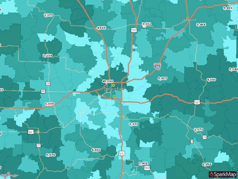
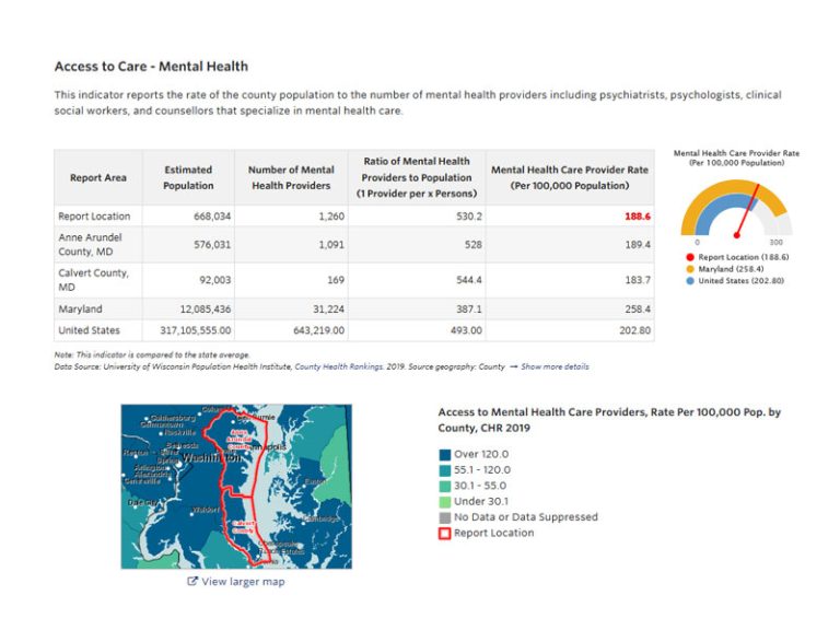
Think about the last time you moved. What was important to you? Maybe you were interested in how walkable the neighborhood was, what the makeup of the school district was like, crime rates, and park access. Many of these variables are also important when writing grant proposals, creating local legislation, and understanding the needs of a community. With SparkMap, you can use the Map Room to select your geographical area and add as few or many layers as are important to you! When you’re done, you’ll have a color-coded map telling the story of your community in a compelling and visually interesting way.
How to Use the Map Room
Before talking about how the Map Room can help with your data visualization, let’s walk through the 5 easy steps of creating your map!
1. Visit SparkMap.org! If you’re a subscriber make sure you’re logged in to save your map and access all the benefits of your membership plan. If you aren’t a subscriber yet, be sure to check out our pricing page and with subscription details to make sure you’re accessing the best data and tools for your needs.
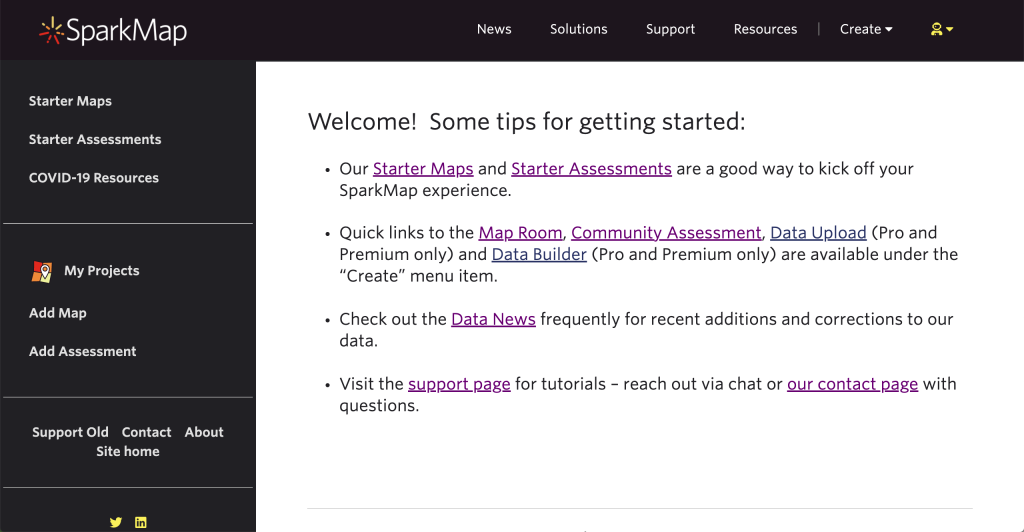
2. Navigate to the Map Room by hovering over the products button and selecting Map Room, or click here!
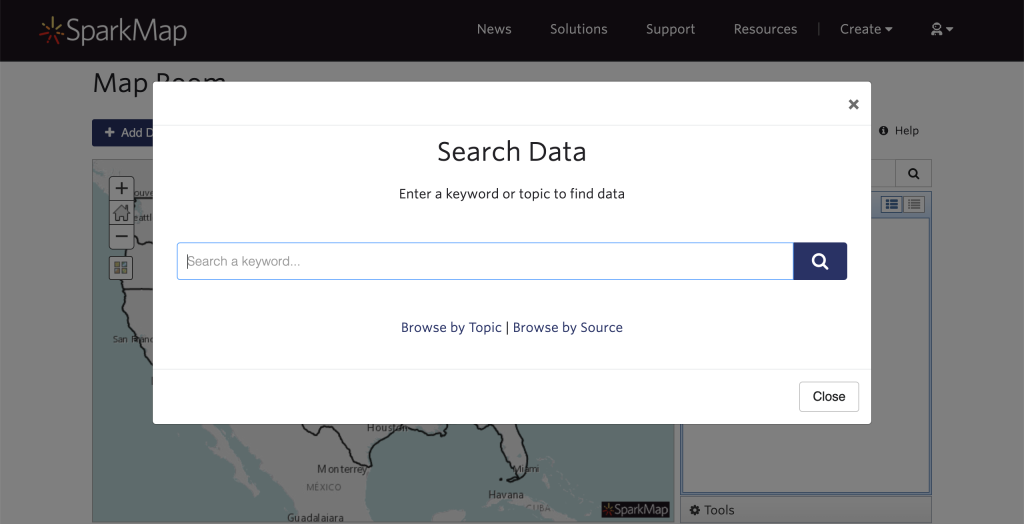
3. Now the fun part– choose your data! Use the “search data” pop up to enter a keyword or scroll down to browse by topic or source. A SparkMap Team tip: we recommend searching one broad key word (e.g., “parks”) rather than including long or very specific searches (e.g., “Park Access and Features in Clark County, NV”). Add as many layers as you’d like by selecting the “add data” button in the top left hand screen.
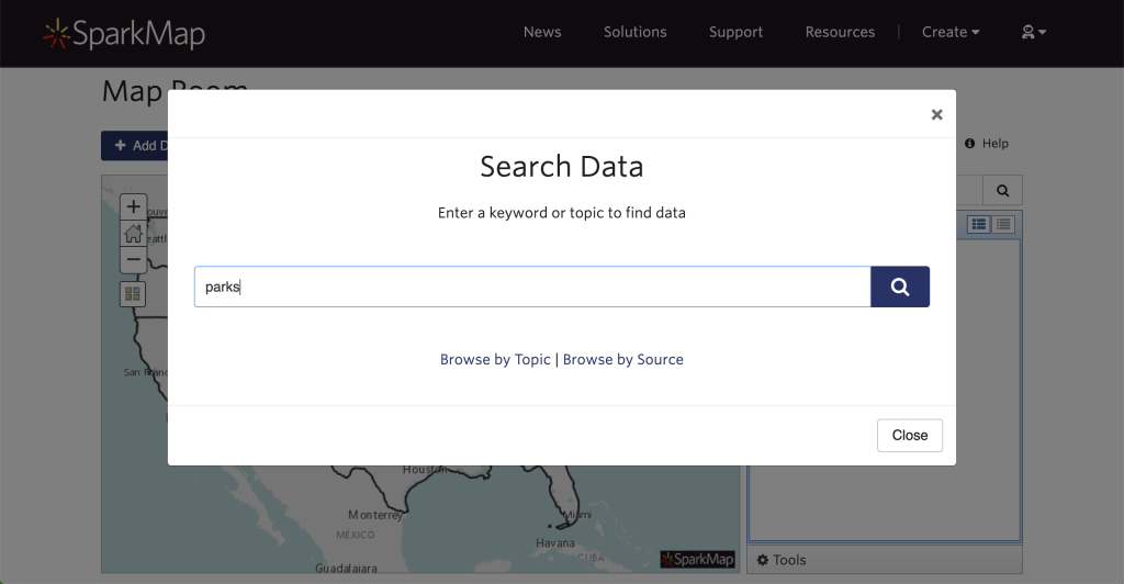
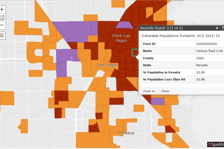
4. Enter your location of interest. You can create free maps of the nation, individual states, or counties. Don’t forget to click on the map to see a clearer explanation of the data in your location.
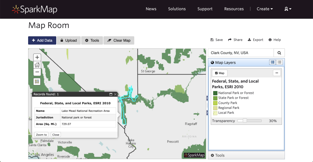
5. Share or export your map! We want to make sure you can use your custom maps, not just look at them in SparkMap. When you’re done adding all of your layers, you can share your map with a hyperlink or export it as an image or PDF.
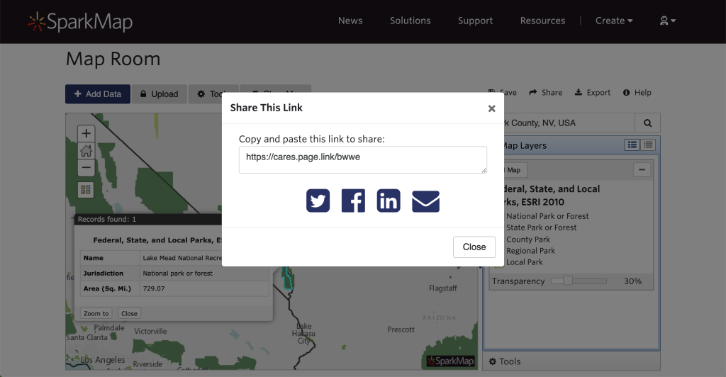
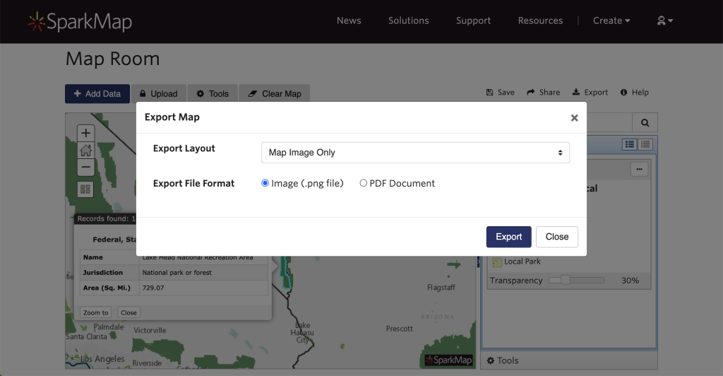
Looking for more detailed instructions on building your own map? Watch our video demonstration below!
You added multiple layers? Great! Let’s look at them.
Adding multiple layers is exactly what we want you to do, but we know it can be a little hard to navigate them all. On the right side of the page, you’ll see your “Map Layers” box. Here you’ll see the name of the data layer, color or symbol codes and an explanation, and a transparency slider. Setting your layers to different levels of transparency helps show you how they overlap.
The Map Layers box isn’t the only way to understand your map. Be sure to zoom in or click on your map to get more information on the area and use the dropdown menu to see results for each of the layers you added. We also suggest exploring the “Tools” section of the Map Room for different options on how to view your layers or customize your map.
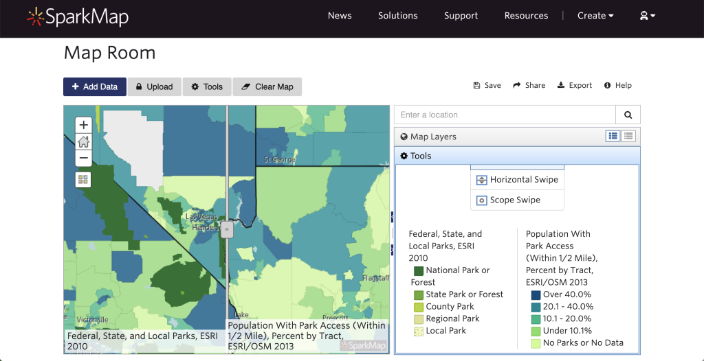
We recommend checking out our Map Room tutorials on the support page for more in depth information on how to create a map in our Map Room, as well as demonstrations of how to use the mask, draw, select, and query tools.
Looking Ahead
Keep your eye on the blog for our next installment—a deep dive into data visualization with the Community Assessment tool. Also on the horizon, we’ll be talking more about the data and map tools our products offer and how they can help you use SparkMap efficiently and effectively!

