4 Ways to Enhance Your Data Visualizations
In this piece, we consider some of the best practices of data visualization and offer 4 key tips to improve your data viz usage.
Learn how to use new ACS data in the Community Needs Assessment. Register for our webinar on 2/15!
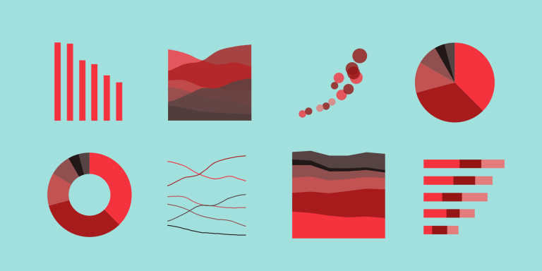
In this piece, we consider some of the best practices of data visualization and offer 4 key tips to improve your data viz usage.

The NCCPI is a robust and valuable dataset – learn more about it and how to access it on SparkMap.

Heart disease is the leading cause of death in the United States. How can we use maps and data to understand where our most at-risk communities are and what interventions may help?

Learn how to use the Select Data tool in the Map Room to see data in context of a specific region or distance from a point. In this example, we’ll look at the data for 501(c)(3)s and (c)(4)s that are within 1 mile of an address.

As we witness COVID-19 variants sweep through the country, we recognize that data for decision-making is more important now than ever. Learn more about what’s happening in your world with data around COVID-19 Vulnerability, Vaccinations, and Hospitalizations.

What are the riskiest disasters that communities should be prepared for and where should resources be allocated? The Federal Emergency Management Agency (FEMA) released a new index – the National Risk Index – to help communities mitigate disasters with more specificity.