W.E.B. Du Bois & Data Visualization History
Here at SparkMap, we’re big fans of streamlined data visualization.
Since you’re here, it’s fair to assume you are too. Have you ever wondered about the history of data visualization and how we ended up here? In particular, have you thought about how the processes of data collection and presentation were carried out before the internet, and before tools like SparkMap?
Data collection and visualization have an old and complex history, as people have long found it useful to create simple visual representations of both quantitative and qualitative data.1 These historical data visualizations are important for some of the same reasons our data visualization tools are important today:
- Data visualization via charts and maps allows viewers to easily analyze large amounts of information, often as it pertains to specific demographics and/or geographic locations.
- Data visualization helps viewers identify trends in data.
- Data visualization is, in turn, a powerful tool for those seeking to understand and spur change within their communities.
W.E.B. Du Bois and “Data Portraits”
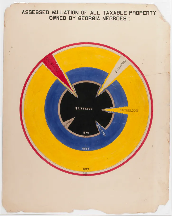
Today, we want to share a bit of this fascinating history by discussing the work of W.E.B. Du Bois (1868-1963). A prolific sociologist, writer, and activist, Du Bois also made significant social contributions through his collection and visual breakdowns of data about Black Americans.2 An especially interesting example is Du Bois’ 1887-1890 collection of hand-drawn and colored “data portraits.” “Data portrait” is simply the phrase by which Du Bois identified his charts and graphs. Just as a painted portrait of a person conveys the person’s appearance to viewers, a data portrait conveys a data set’s key characteristics.3
Du Bois’ data portraits represent data related to Black populations in Georgia and in the US at large, addressing topics such as: the number of Black children enrolled in public schools (Figure 1), occupations of Black Americans (Figure 2), and Black Americans’ dissemination across urban and rural locations (Figure 3).
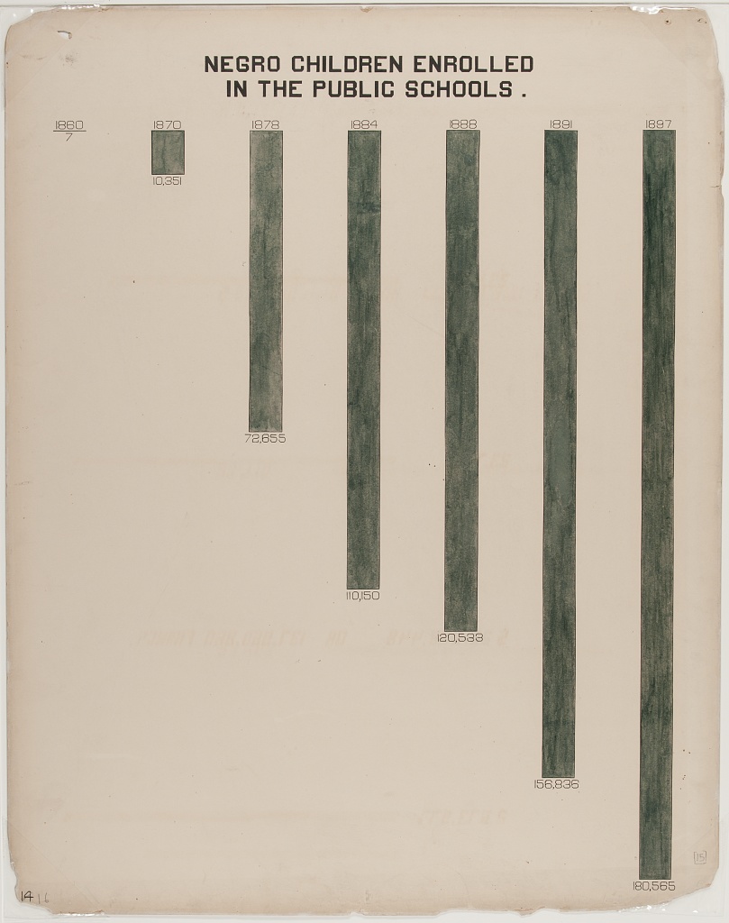
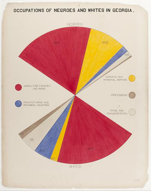
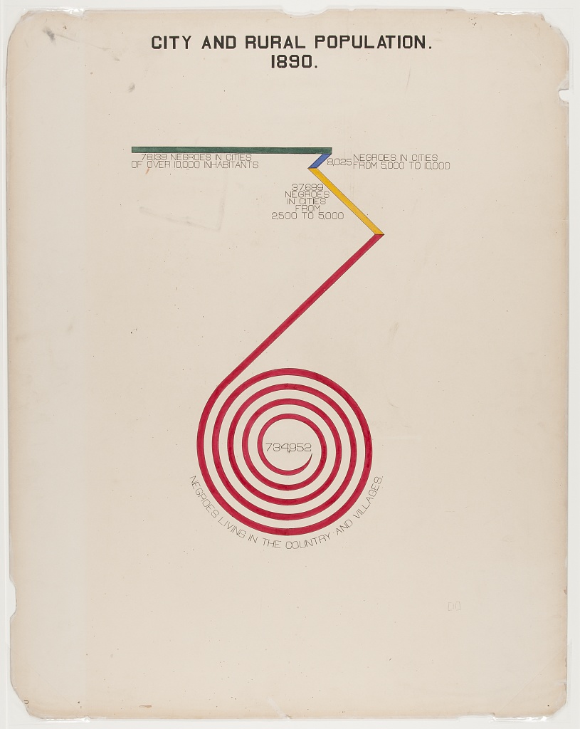
As a professor at Atlanta University, Du Bois began gathering data about Black populations in the US well before he conceptualized his data portraits.4 He obtained his data through extensive surveys produced and disseminated with the aid of his students and a vast network of Black scholars. He then used his findings to support his research and supplement his lectures. In 1897, Du Bois and his students began producing their data portraits when Du Bois’ former classmate, Thomas Junius Calloway, asked him to contribute to an exhibition on African American life for the 1900 World’s Fair in Paris.
From 1897 to 1899, Du Bois and his students aggregated and verified their previously gathered data, which they then used to produce sixty data portraits based on their research. Through these portraits, the team sought to highlight the nuanced ways in which racial segregation, which Du Bois dubbed “the color line,” impacted the lives of Black Americans at this time.5 They also sought to convey data regarding how Black Americans lived and the things they achieved, documenting matters such as the property they owned, and even the prices of their kitchen appliances (Figure 4). As Du Bois put it, the data portraits sought to provide, “an honest straightforward exhibit of a small nation of people, picturing their life and development without apology or gloss, and above all made by themselves.”6

Du Bois and his team recognized that their maps must not only accurately and clearly represent their data, but had to appeal to a general audience if they were to have any impact. As Aldon Morris writes, “while unmoving prose and dry presentations of charts and graphs might catch attention from specialists, this approach would not garner notice” from the general public.7 In response to this, Du Bois and his team created portraits of data that are incredibly striking and dynamic, but still easily interpreted.
After their display in Paris, during which they were well received, the data portraits went on to be displayed across the US and were later housed in the Library of Congress. In their early display contexts, they acted as compelling educational tools, and in the Library of Congress, they served as research materials for visiting scholars. Regardless of display, Du Bois’ innovative data visualization collection – and his overall focus on using data to highlight Black experiences – remains deeply impactful today. Scholars still utilize Du Bois’ research, and we can still incorporate data visualization to make clear the socio-economic advances and disparities of various communities.
Creating Contemporary Data Portraits
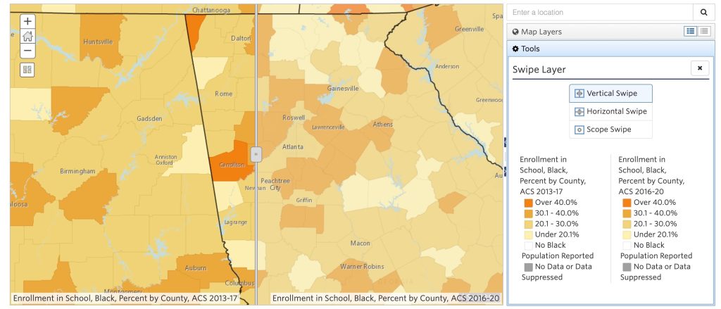
This week, we’ve used SparkMap’s Map Room and Assessment tool to recreate a few of Du Bois’ data visualizations using contemporary data sets. In Figure 5, we’ve mapped the changes in Black students’ enrollment in Atlanta schools from 2013 to 2020, demonstrating that in several areas, enrollment boosted significantly.
We also created simple visualizations of data representing the racial makeups of Fulton County, GA, as compared to the US at large (Figure 6).

Like Du Bois’ data visualizations, the data contained in your maps and assessments can serve as jumping-off points for research, learning, and activism. The first step to creating change is to learn about your communities.
Sources
- Michael Friendly, Wolfgang Haerdle, Chun-Houh Chen, and Anthony Unwin’s “A Brief History of Data Visualization,” https://www.researchgate.net/publication/226400313_A_Brief_History_of_Data_Visualization.
- For a more general overview of Du Bois’ work, see: https://www.britannica.com/biography/W-E-B-Du-Bois.
- To explore all of Du Bois’ data portraits, flip through Whitney Battle-Baptiste and Brit Rusert’s book, W.E.B. Du Bois’ Data Portraits: Visualizing Black America (Princeton Architectural Press, 2018).
- https://www.smithsonianmag.com/history/first-time-together-and-color-book-displays-web-du-bois-visionary-infographics-180970826/
- Du Bois discusses the “color line” in his book The Souls of Black Folk: https://www.gutenberg.org/files/408/408-h/408-h.htm.
- https://hyperallergic.com/476334/how-w-e-b-du-bois-meticulously-visualized-20th-century-black-america/
- See Morris’ essay in Whitney Battle-Baptiste and Brit Rusert’s book, W.E.B. Du Bois’ Data Portraits: Visualizing Black America (Princeton Architectural Press, 2018).

